In every trader’s journey, market interaction is crucial for success; charts assist in this undertaking. These charts serve many purposes, from confirming trends and reversals to selecting precise entry and exit points; any trader must learn the art of chart analysis.
In this guide, we have attempted to describe the six major types of charts, their uses, and the environments that favor each type. In addition, some overlays and indicators will be introduced that could help you improve your ability to read charts.
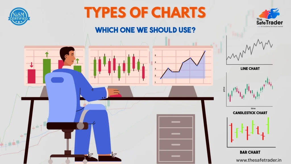
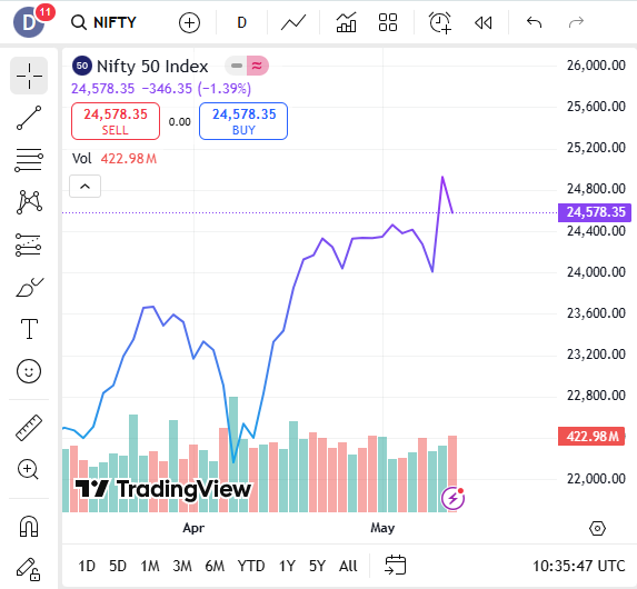
1. Line Chart
Best For: Beginners, long-term investors, quick trend overviews
A line chart is the simplest type of chart. It plots only the closing prices over a specific time period, connecting them with a line.
Use It When:
- You are interested in a quick snapshot of the overall direction of the price.
- Comparing many assets against each other without distractions.
- Focusing on long-range movements and macro trends.
Pro Tip:
Line charts also help to identify major support or resistance over weekly or monthly timeframes; they are great at suppressing short-term noise.
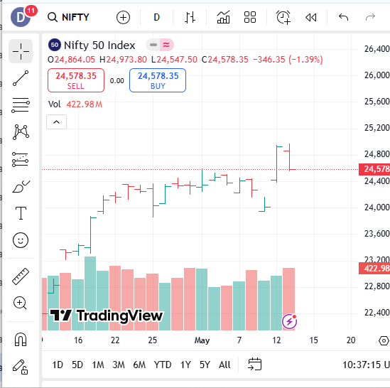
2. Bar Chart (OHLC Chart)
Best For: Intermediate traders, price range analysis
Each bar represents a time period and shows Open, High, Low, and Close (OHLC) prices. The left notch is the open, the right is the close.
Use It When:
- Whenever you want to get detailed price information without switching to candlesticks.
- To get a feel for price ranges and volatility during a given period.
- Trading price breakouts or fade away.
Pro Tip:
Use bar charts with volume indicators to see if prices are moving with institutional support.
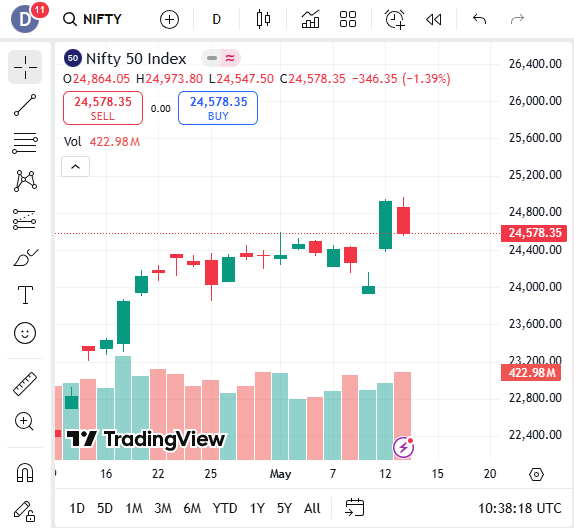
3. Candlestick Chart
Best For: Most traders, especially those who use technical analysis
Candlestick charts display the same OHLC data as bar charts, but in a color-coded, visual format. Green (or white) candles typically show bullish movement, while red (or black) indicate bearish.
Use It When:
- To identify the market sentiment, reversals, or continuation patterns.
- For trading short-term (day or swing trading).
- Whenever you use candlestick patterns such as Engulfing, Hammer, Doji, etc.
Pro Tip:
Multiple time frame analysis is useful. For example, check the 1-hour, 4-hour, and daily candlestick patterns to confirm the entry or exit signals.
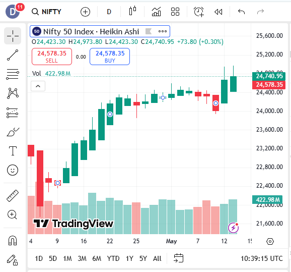
4. Heikin-Ashi Chart
Best For: Trend followers who want cleaner charts
Heikin-Ashi charts modify the traditional candlestick by averaging price data to filter out market noise and highlight trends.
Use It When:
- You want to stay longer in the trade without being stopped out from minor reversals.
- Identifying strong bullish and bearish runs.
- Filtering false breakout signals.
Pro Tip:
The Heiken Ashi candle should be paired with a momentum indicator such as MACD or RSI to confirm the strength of the trend before entering a trade.
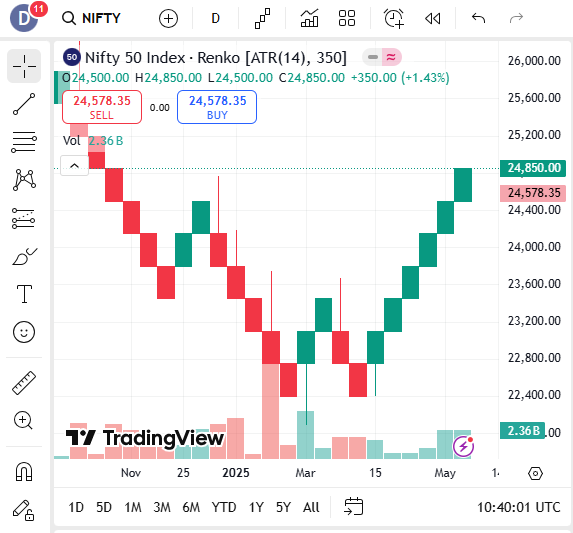
5. Renko Chart
Best For: Price-focused traders, breakout strategies
Renko charts are built using price movement only, not time. A new brick forms only when the price moves a fixed amount, helping eliminate noise.
When to Use:
- If you want to prevent choppy price action and are looking at a clear trend.
- When you build a rule-based breakout system.
- For backtesting your strategies on cleaner data.
Pro Tip:
Combine Renko charts with moving averages to set up a trend-following system that gives fewer false signals.
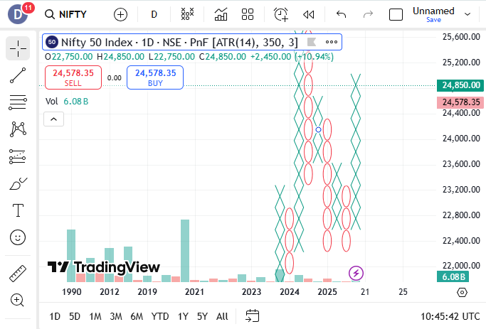
6. Point and Figure (P&F) Chart
Best For: Identifying support/resistance and breakout zones
P&F charts use X’s for rising prices and O’s for falling prices, ignoring time completely. They focus purely on significant price movement.
Best Use Cases:
- Analyzing long-term price movements or major breakouts.
- Looking for clean supply/demand zones.
- Want to avoid overtrading and focus on the big moves.
Pro Tip:
Point and figure may be combined with horizontal counts for price targets—a concept unique to this chart type.
Bonus: Common Overlays & Indicators for Any Chart
Regardless of the chart type you use, overlays and indicators can improve your analysis:
Common Overlays:
- Moving Averages (MA, EMA): Help smooth out price and identify trends.
- Bollinger Bands: Show volatility and overbought/oversold levels.
- Ichimoku Cloud: Provides trend direction, support/resistance, and momentum.
Popular Indicators:
- Relative Strength Index (RSI): Identifies overbought or oversold conditions.
- MACD (Moving Average Convergence Divergence): Measures momentum and trend direction.
- Volume: Confirms the strength behind price movements.
How to Choose the Right Chart Type
| Your Goal | Use This Chart |
| Quick overview of trends | Line Chart |
| In-depth price analysis | Candlestick or Bar Chart |
| Filtering noise for clear trends | Heikin-Ashi, Renko |
| Identifying breakouts/support | Point and Figure, Renko |
| Reducing emotional trading | Heikin-Ashi, Renko |
Final Thoughts:
Each chart is supposed to tell a story, and sometimes that story varies with the chart type. Line charts are just simplifications. Candle charts show human emotions. Renko removes unnecessary noise. And Heikin-Ashi provides clarity in chaotic situations.
Don’t get intimidated, attempting to master all chart variations all at once. Just start with candlestick charts, learn price action, and then choose more charts as per your choice of trading.
Pro Tip: Real-time practice with chart types and timeframes using charting software like TradingView or ThinkorSwim is tremendously helpful.
Want to Know More Details, Please Click Here
